모든 인터페이스를 개선하기 위한 14가지 논리 기반 UI 디자인 팁
원본 링크 : [링크]
14 logic-driven UI design tips to improve any interface
UI design tips to improve your interface designs using logic rather than gut feel.
uxplanet.org
<간단 요약>
직감이 아닌 논리를 사용해서 인터페이스 디자인을 개선하기 위한 UI 디자인 팁으로
간단한 설명과 함께 깔끔하고 인지가 잘되는 자연스러운 UI 디자인을 하는 방법을 정리한 14가지 팁이다.
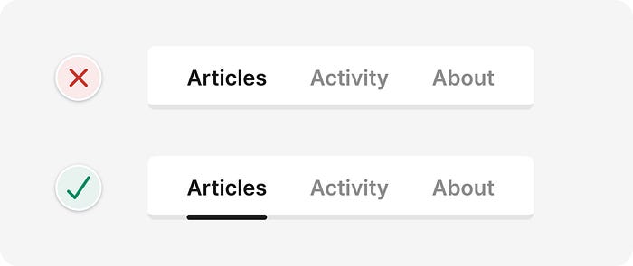
1. 얼마나 밀접하게 관련되어 있는지에 따라 공간 요소 배치
( Space elements based on how closely related they are )

2. 인터페이스 요소의 명암비가 3:1 인지 확인
( Ensure interface elements have a 3:1 contrast ratio )
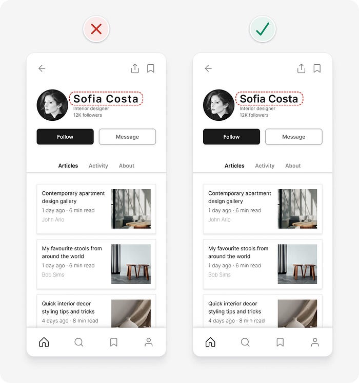
3. 가장 중요한 작업에 단일 기본 버튼 사용
( Use a single primary button for the most important action )

4.버튼의 대상 크기가 충분한지 확인
( Ensure buttons have a sufficient target size )

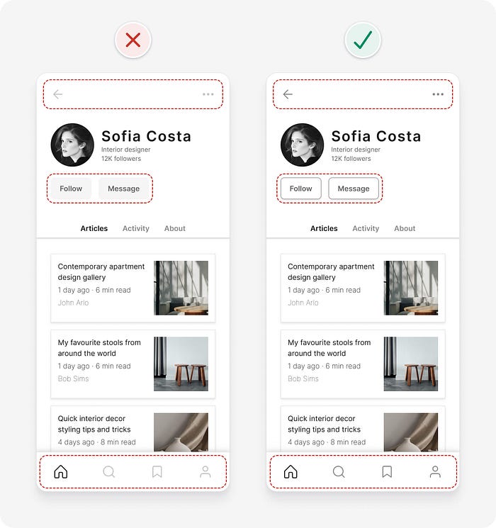
5 중요한 콘텐츠가 표시되는지 확인
( Make sure important content is visible )

6. 큰 텍스트의 문자 간격 줄이기
( Decrease letter spacing for large text )
7.색상만을 지표로 사용하지 마십시오.
(Don’t rely on colour alone as an indicator)
8.여러 정렬을 사용하지 마십시오.
( Try to avoid using multiple alignments)

9. 텍스트의 명암비가 4.5:1인지 확인
( Ensure text has a 4.5:1 contrast ratio )

10. 인터페이스를 단순화하기 위해 컨테이너 제거를 고려하십시오.
( Consider removing containers to simplify an interface )

11. 일반 및 굵은 글꼴 두께만 사용
( Use regular and bold font weights only )
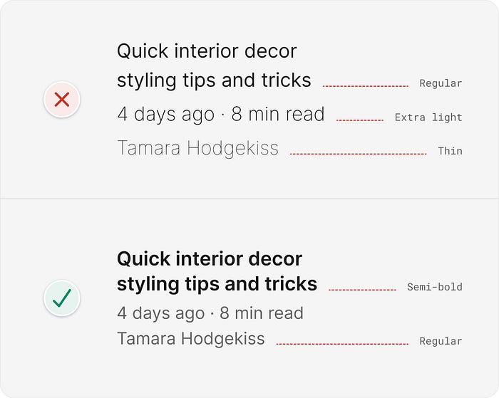
12. 일관성 유지
(Be consistent)
13. 미니멀리즘과 단순함을 혼동하지 마십시오
(Don’t confuse minimalism with simplicity)
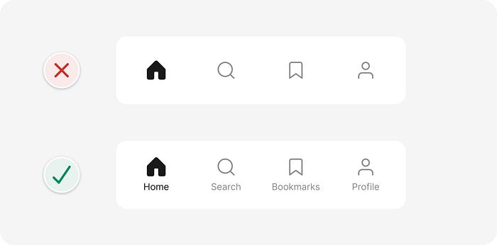
14. 균형 아이콘 및 텍스트 쌍
( Balance icon and text pairs)
굉장히 정리가 잘되어 있고 위에 정리된 모든 항목을 모두 다 지키기보다는
어떠한 차이점이 있고 상황에 따라 적절하게 잘 사용하는것이 좋다.
그림과 함게 설명이 잘되어있어서 꼭 원문을 보는것을 추천한다.
※모든 사진에 대한 저작권은 Adham Dannaway 에 있습니다.
'개발 > 읽을거리' 카테고리의 다른 글
| 읽을거리) 큰 차이를 만드는 10가지 작은 UI 수정 (0) | 2025.09.11 |
|---|---|
| 읽을거리) 개발자가 코드 문서화를 꺼리는 진짜 이유 (2) | 2025.09.01 |
| 읽을거리) Unity Tool을 사용한 2D Animation 이론 (2) | 2025.07.29 |
| 읽을거리) 10년후 어렵게 배운 코딩에 대한 12가지 어려운 진실 (3) | 2025.07.22 |
| 읽을거리) 상위 1% 엔지니어의 7가지 습관(simple habits of the top 1% of engineers) (0) | 2025.07.18 |


댓글